Summer Lemons
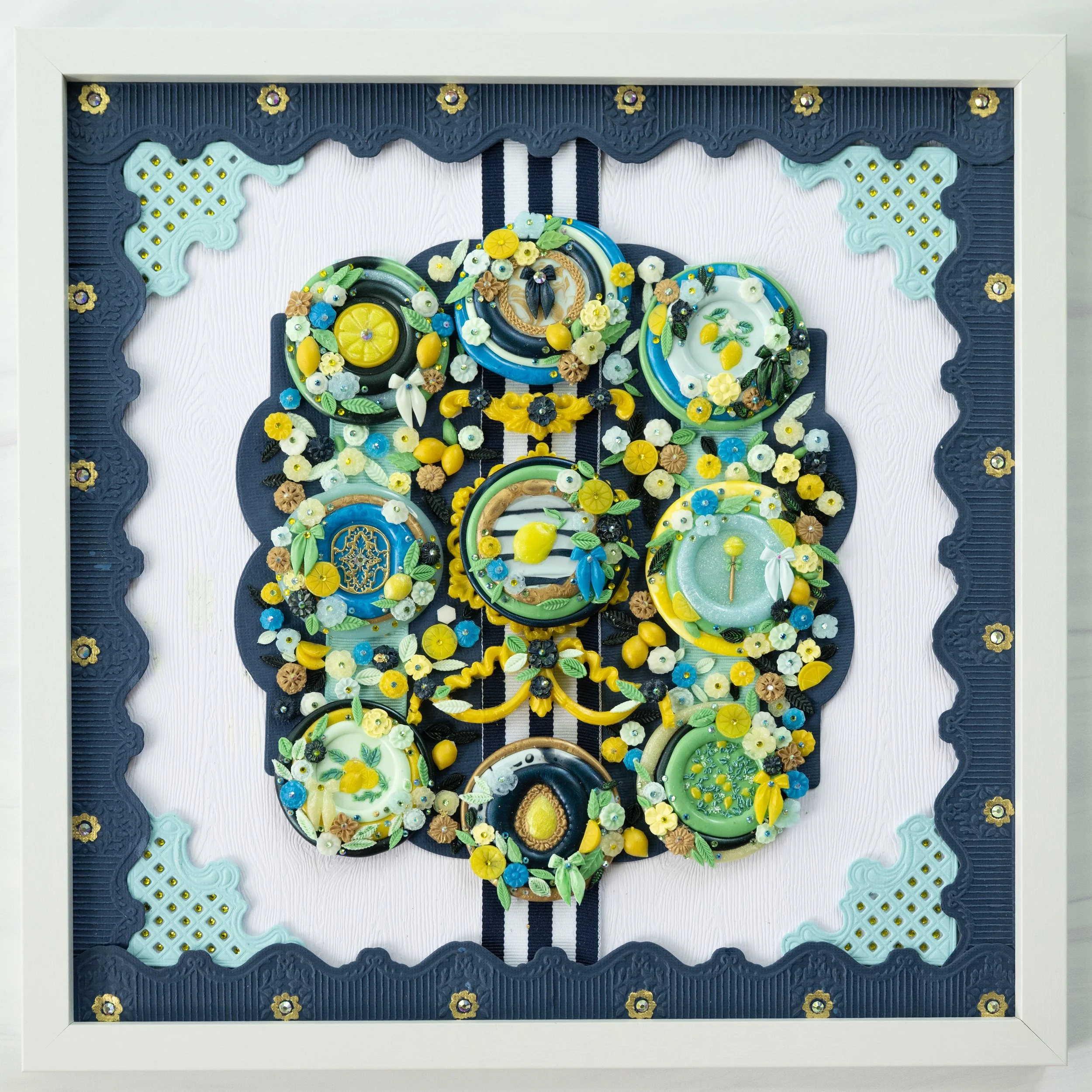
I’ve definitely jumped into the lemon trend. There’s something about lemons that even just thinking about them is like a multi-sensory experience! My mouth will water at the thought of them, plus the bright color seems to embody summer! I had been wanting to work in a palette that featured lemon yellow, navy, and green, and this is what I came up with!
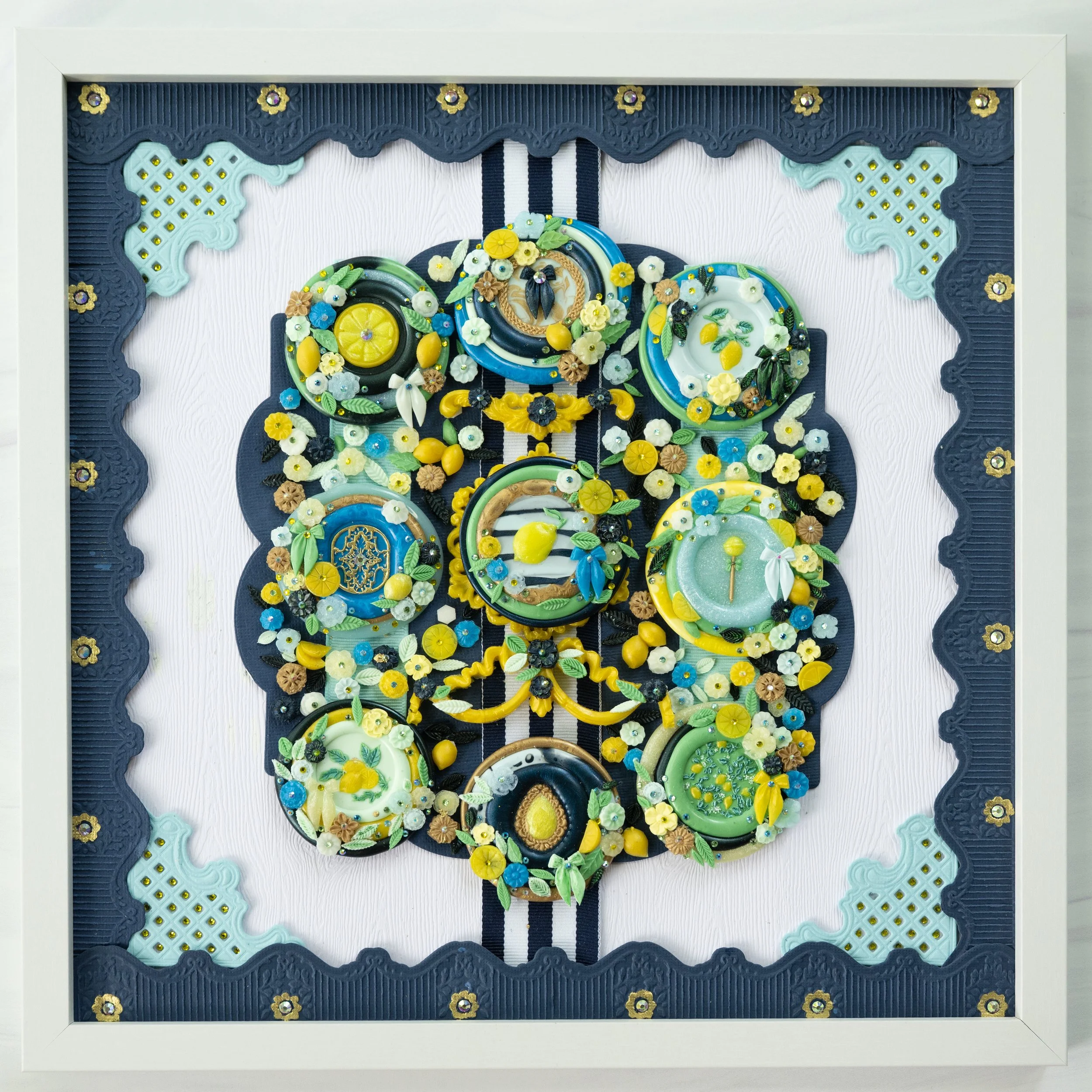
Summertime and Lemons!
So, these are the basic steps I take when doing a wax seal assemblage (warning! long! and more photos and links below!):
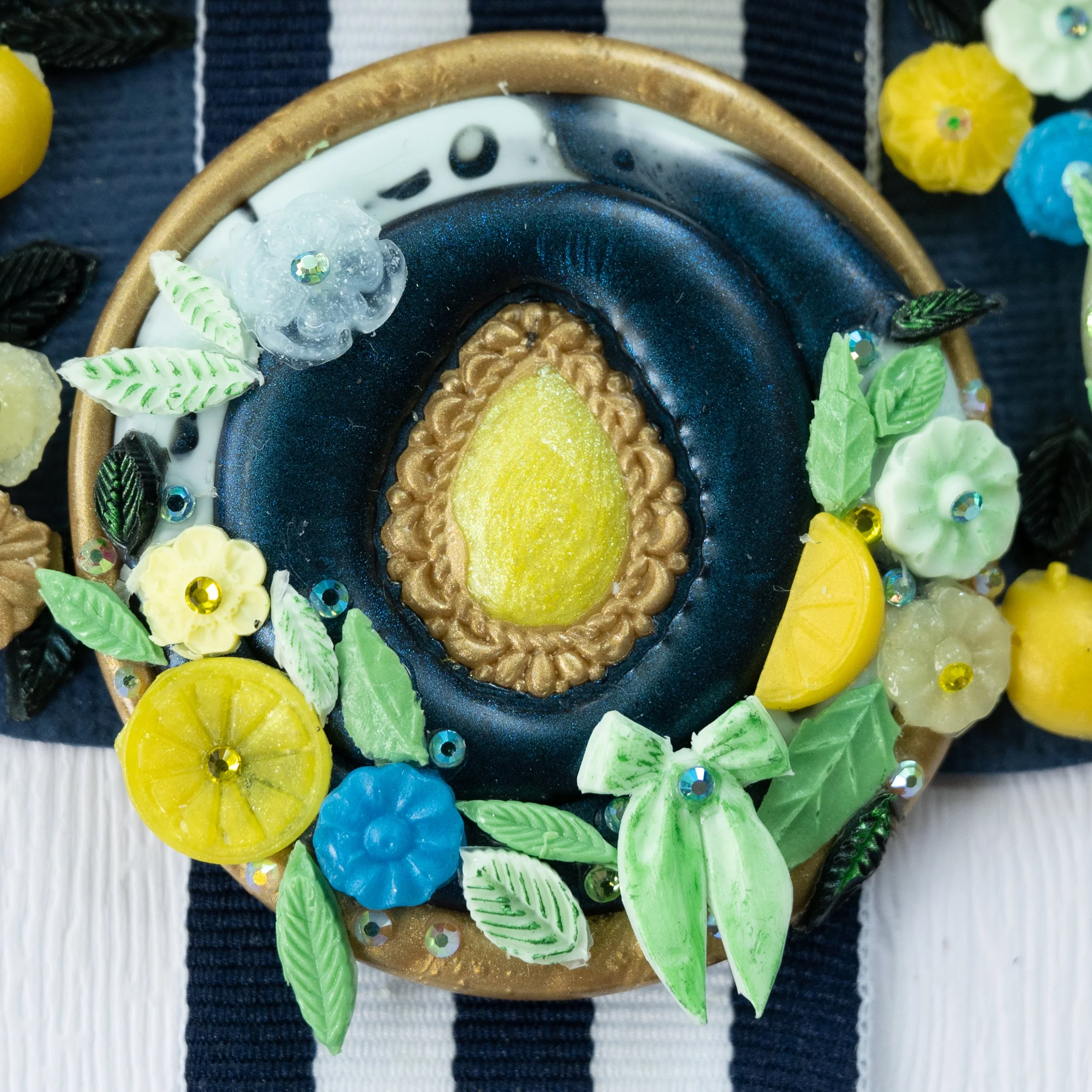
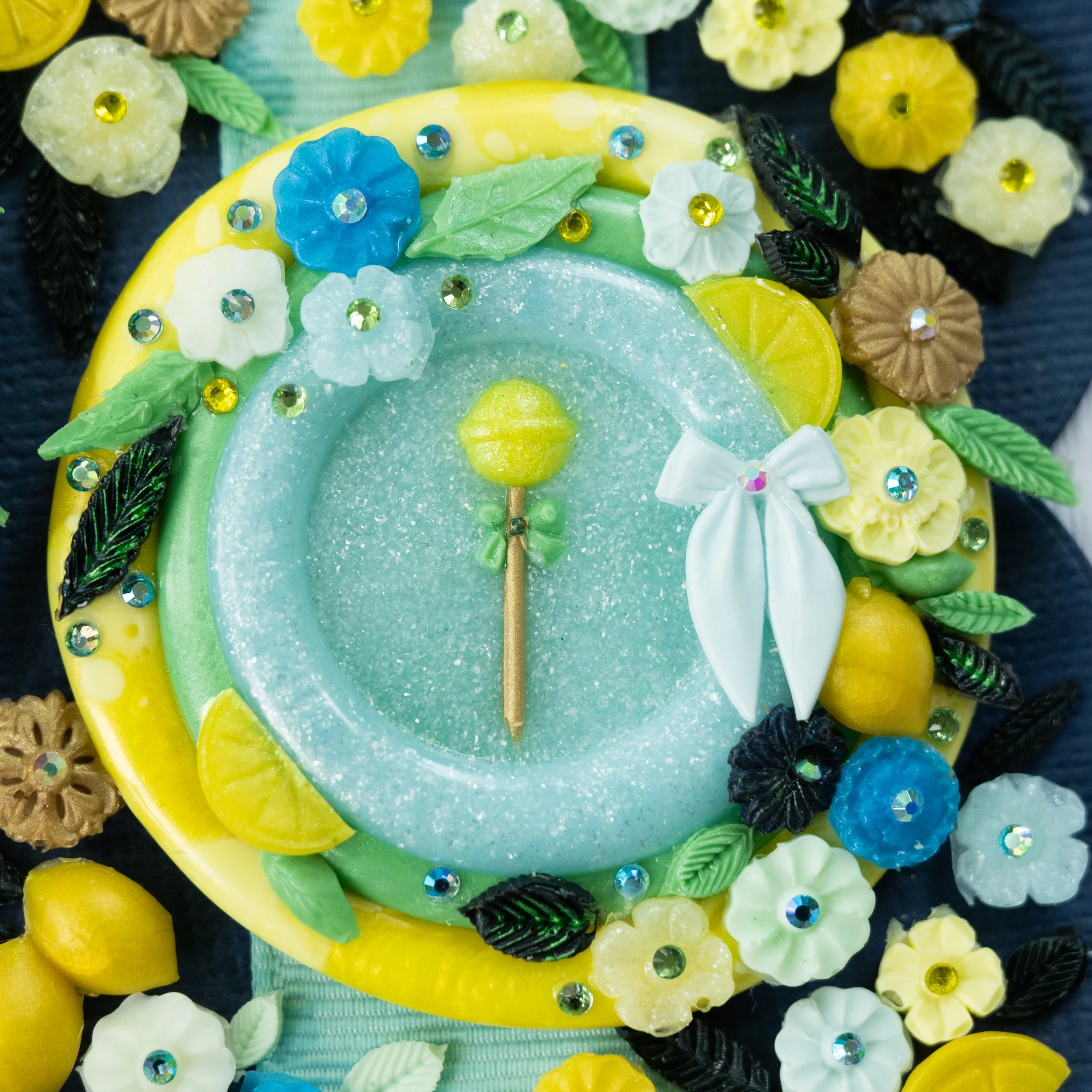
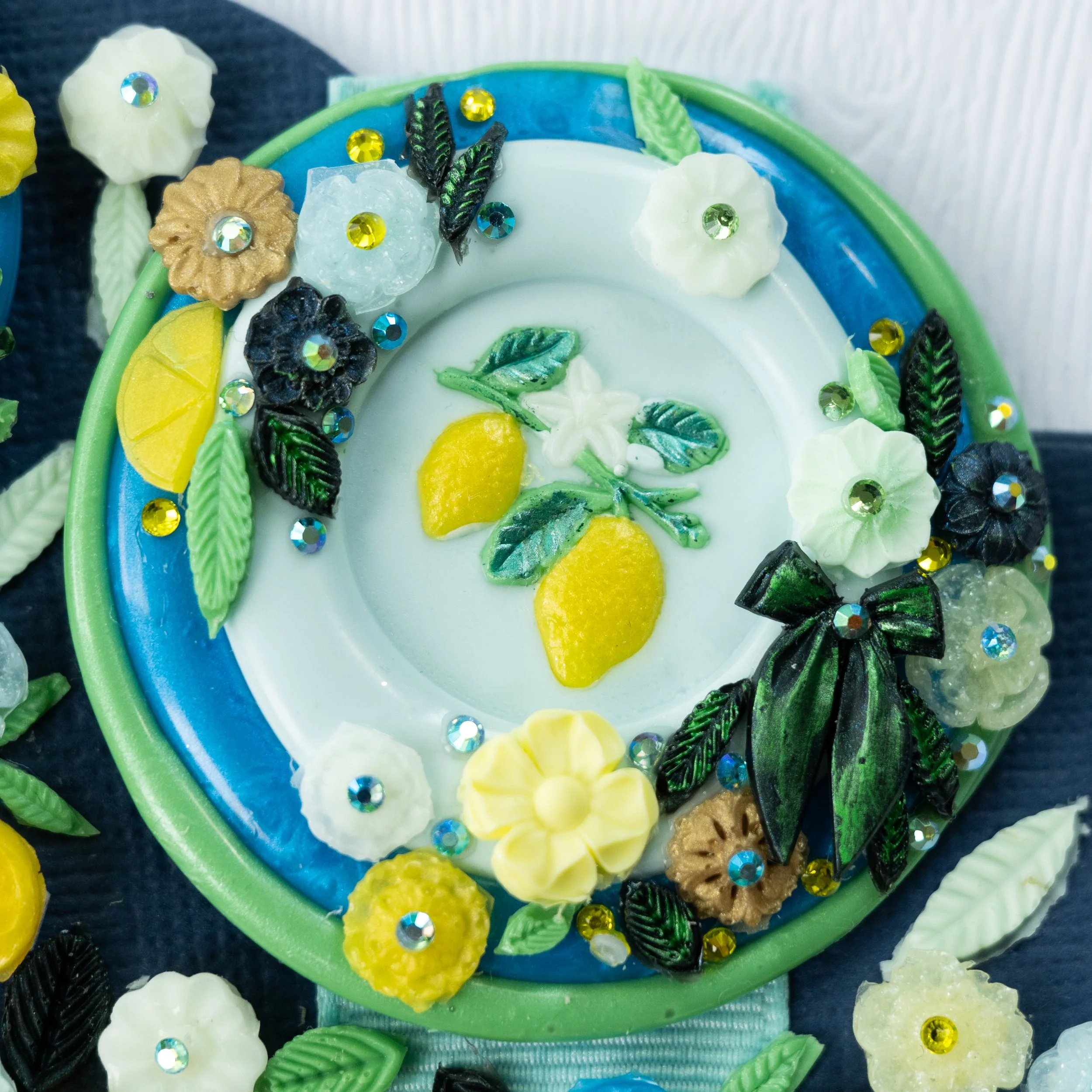
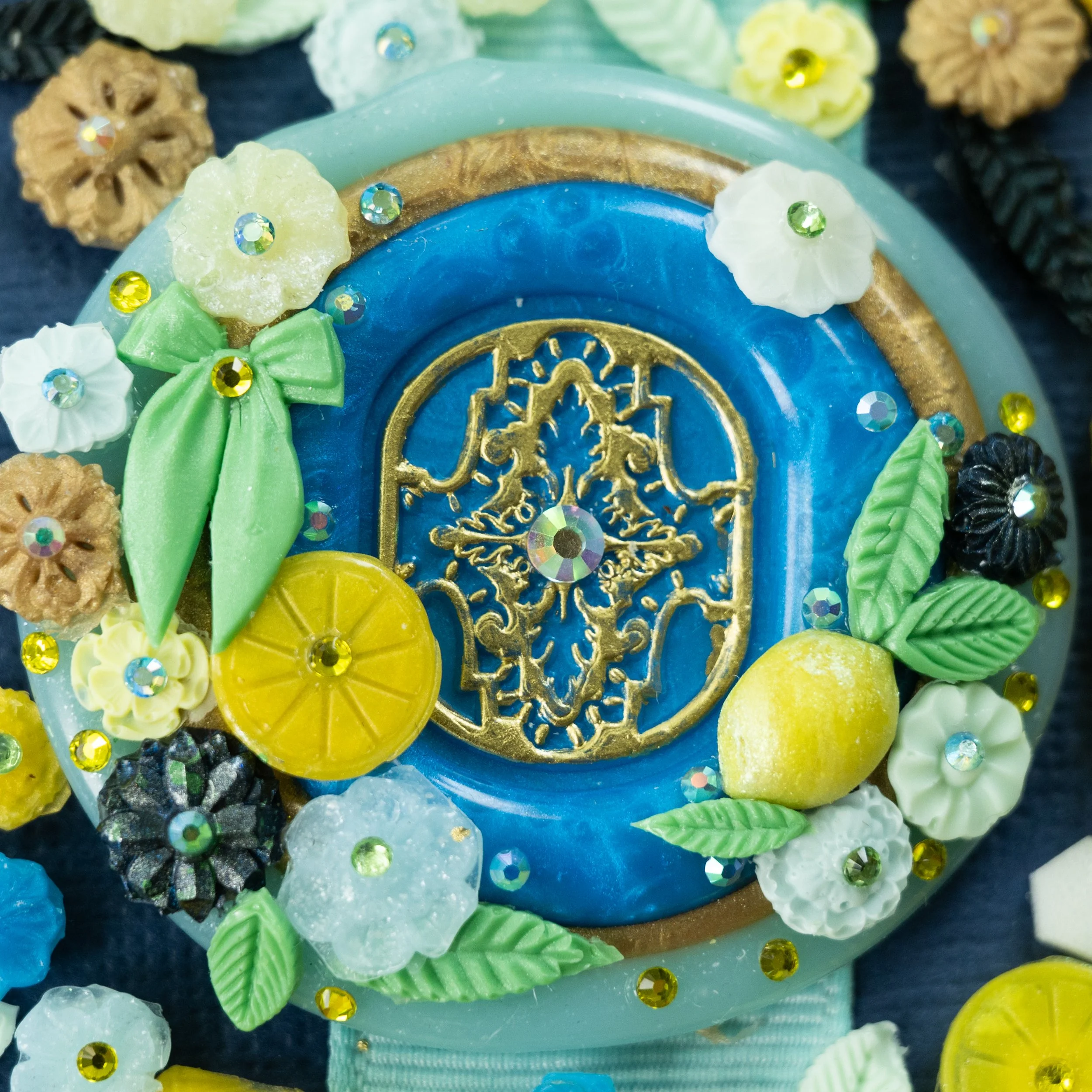
1) I go through my stamp collection and try to assemble a collection that evokes a certain idea or feeling. I had to decide here if I wanted to go more “Mediterranean” in my approach. I decided I wanted to evoke “elegant summertime lemons,” so while I included what I call a “filigree” type stamp in a Mediterranean blue, I also included a lemon lollipop, a lemon-colored “gem,” and some regency inspired ornamentation. I usually pick out more stamps than I actually end up using, and then just eliminate as I work. I do try to determine my centerpiece stamp from the beginning, although in this case, I wasn’t entirely sure about that until further into my process.
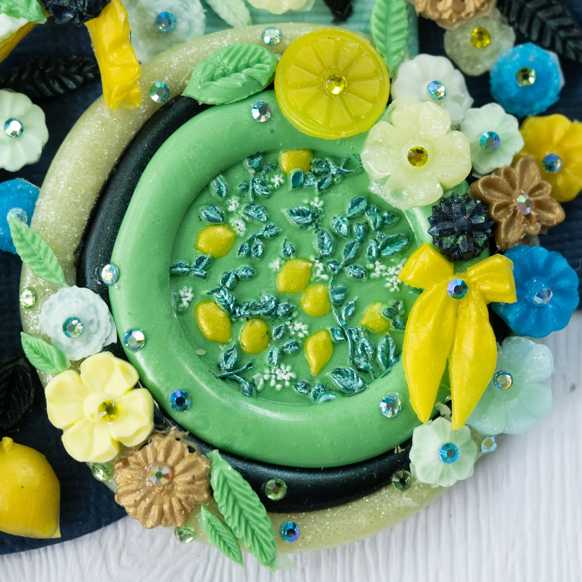
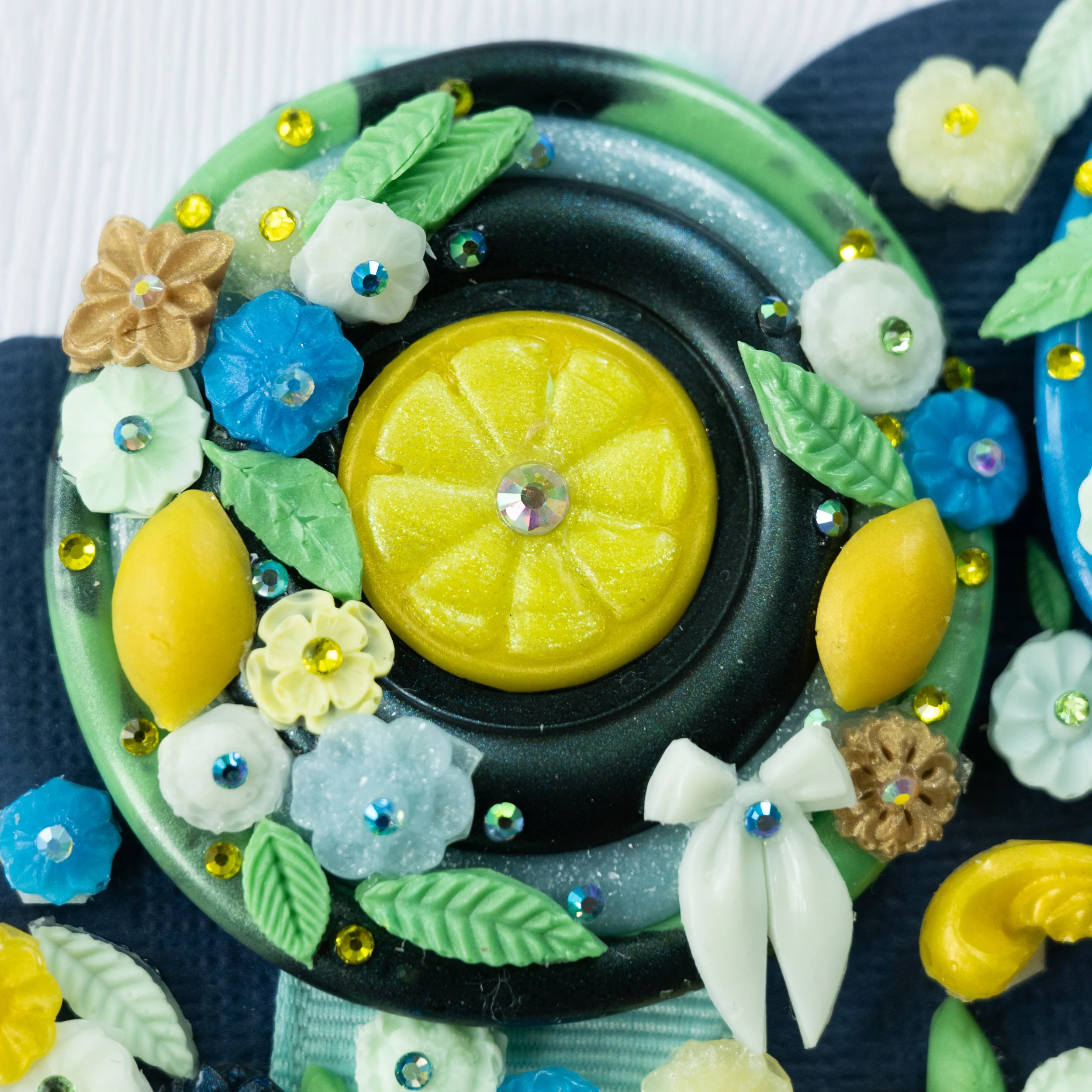
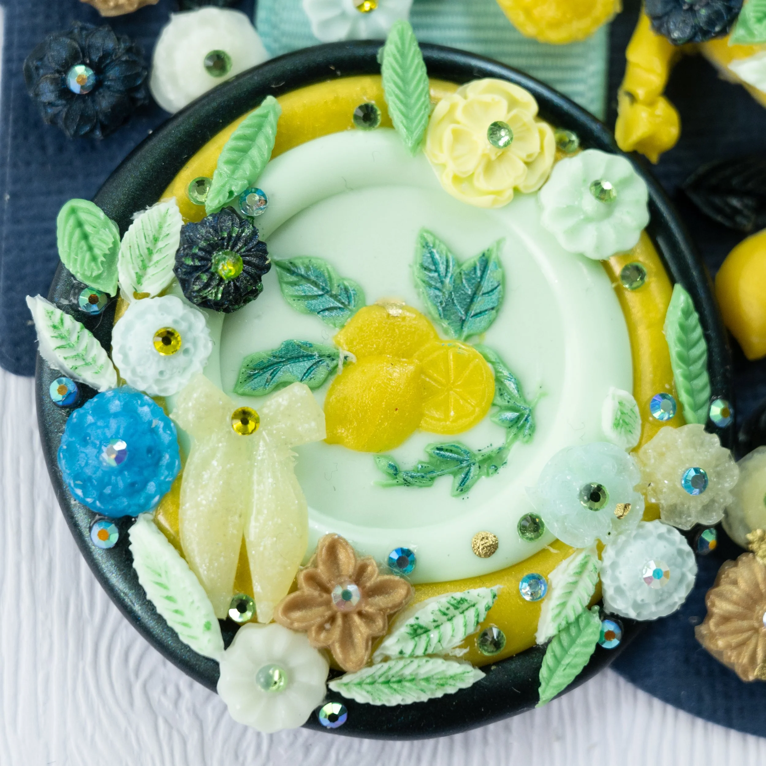
2) I pick out a palette of waxes. In this case, I used mainly waxes from Air of Secrecy, as their color selection is so wide and always inspiring. I do like to mix my own colors occasionally, and to do this, I usually use mica pigments from Eye Candy Pigments. I did custom color my centerpiece lemon, so up close and in person, you will see that it glimmers slightly green at the edges, which came from using a transference powder. I also used this color in the internal lemon segments on the top right lemon slice seal. The colors I used from Air of Secrecy include: Spellbound, Gladiator Gold, Egg White, The Raven, Baby Blue, Frosty Pineapple, Creme de Mint, Electric Blue, Under the Mistletoe, and Banana Pudding. Much of the time, I use 3-4 shades of the same color, so a light, medium, and dark version, plus transparent. I also used a transparent blue and transparent yellow to which I added a glitter mica powder from Eye Candy. Again, I usually pick more colors than I end up using in the piece and figure things out along the way.
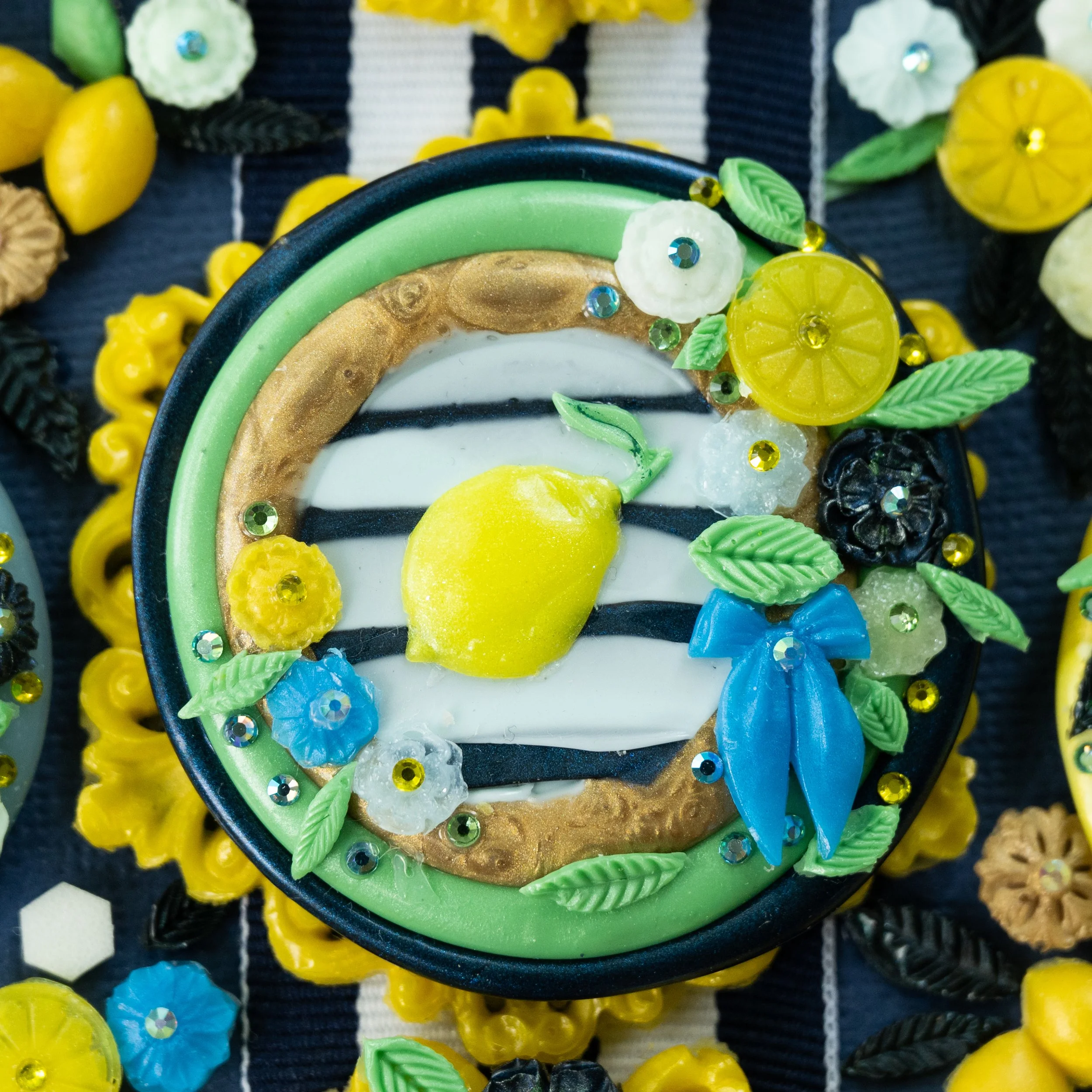
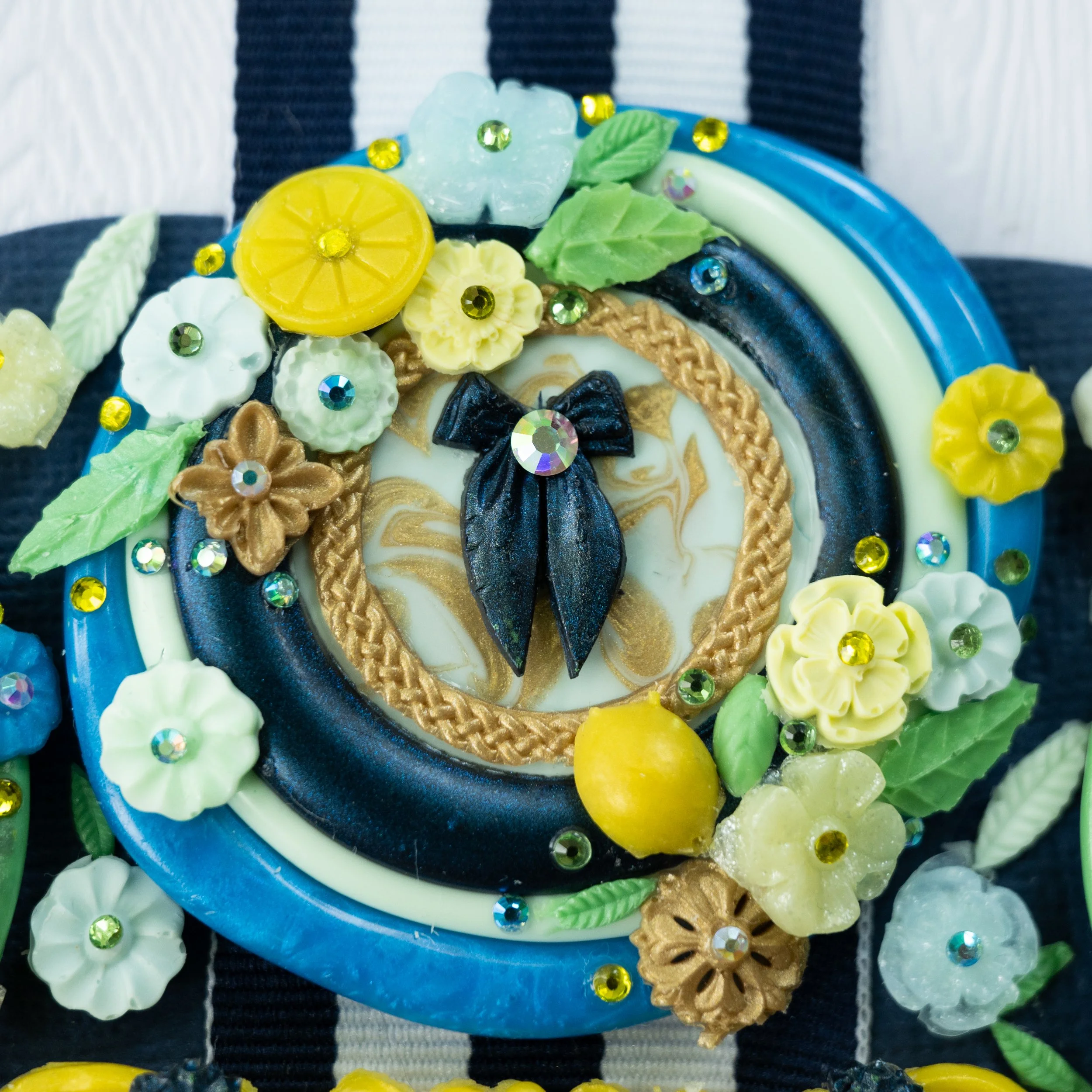
3) I press the seals. I try to think of each seal independently, as its own little jewel. In this case, I wanted to try making a background with stripes, and a marbling technique I saw demonstrated by @Lanabylanadesign. I like to do a triple lip for each because it brings in more color - this was a technique I credit to @Stellasacrum who used it to create beautiful candy like layered seals.
4) I also experimented with painting certain elements after the seal was complete and I found that using acrylic metallic and glitter markers works super well. A tip Kathryn Hastings gives in her wax seal course is to use a piece of wrapping plastic as a palette and to “pump” a small amount of ink/paint onto the plastic and paint onto the seal. This gives much more control. I also used Kamenskaya English Gold gilding paint for the gold highlights. This is an amazing product for gold highlights and I highly recommend it.
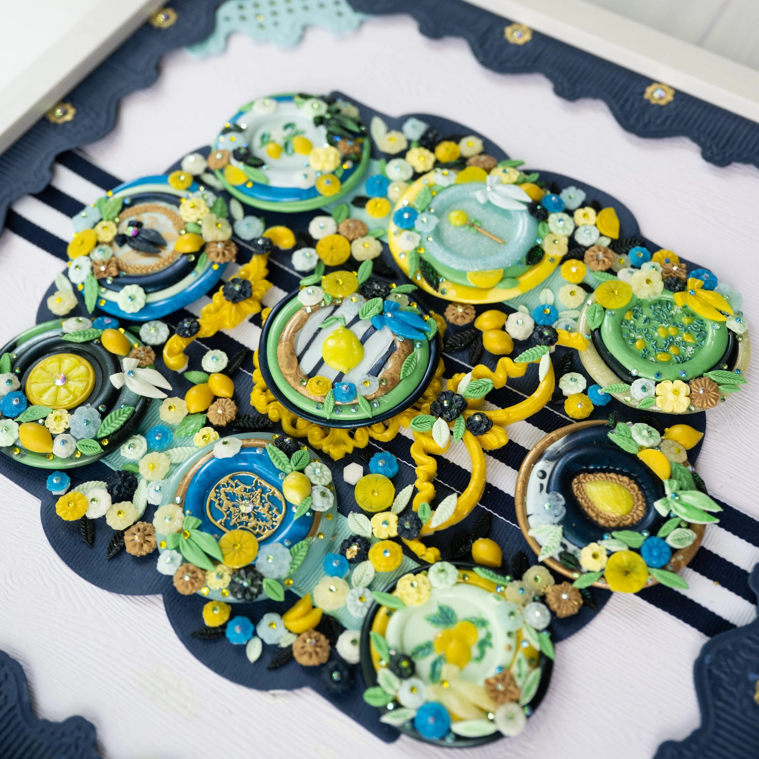
5) As I press each seal, I begin to do a tentative layout because I want to keep the colors within about an 8 color palette range for cohesiveness, and to try to balance the colors out so I don’t have too much of the same color next to each other. This will get revised throughout the process. I also try to balance the “symbolic weight” of the seals and the size of the seal symbol. In this case, I wanted to keep seals with featuring lemons in the center and the corners, interspersed with “secondary” or supportive images like the gem, the lollipop, the filigree, etc.
6) Then, I move into creating ornamentation for the seals using silicone molds. The flowers, leaves, some of the lemon shapes, and the “swag” between the center line of seals are all made from wax poured into silicone molds. A lot of these molds are intended to make nail charms, but they work really well for wax also! So, all of the ornaments here are made from wax, except the rhinestones. I basically create a ton of ornaments from my chosen molds, prepare them by cutting off excess wax, and then just take my big pile and start to place them on my layout. At this point, my layout needs to be largely complete because I want the ornaments to help anchor each seal, so to speak - I will place more ornamentation on the outer boundaries of each seal that don’t abut the center seal.
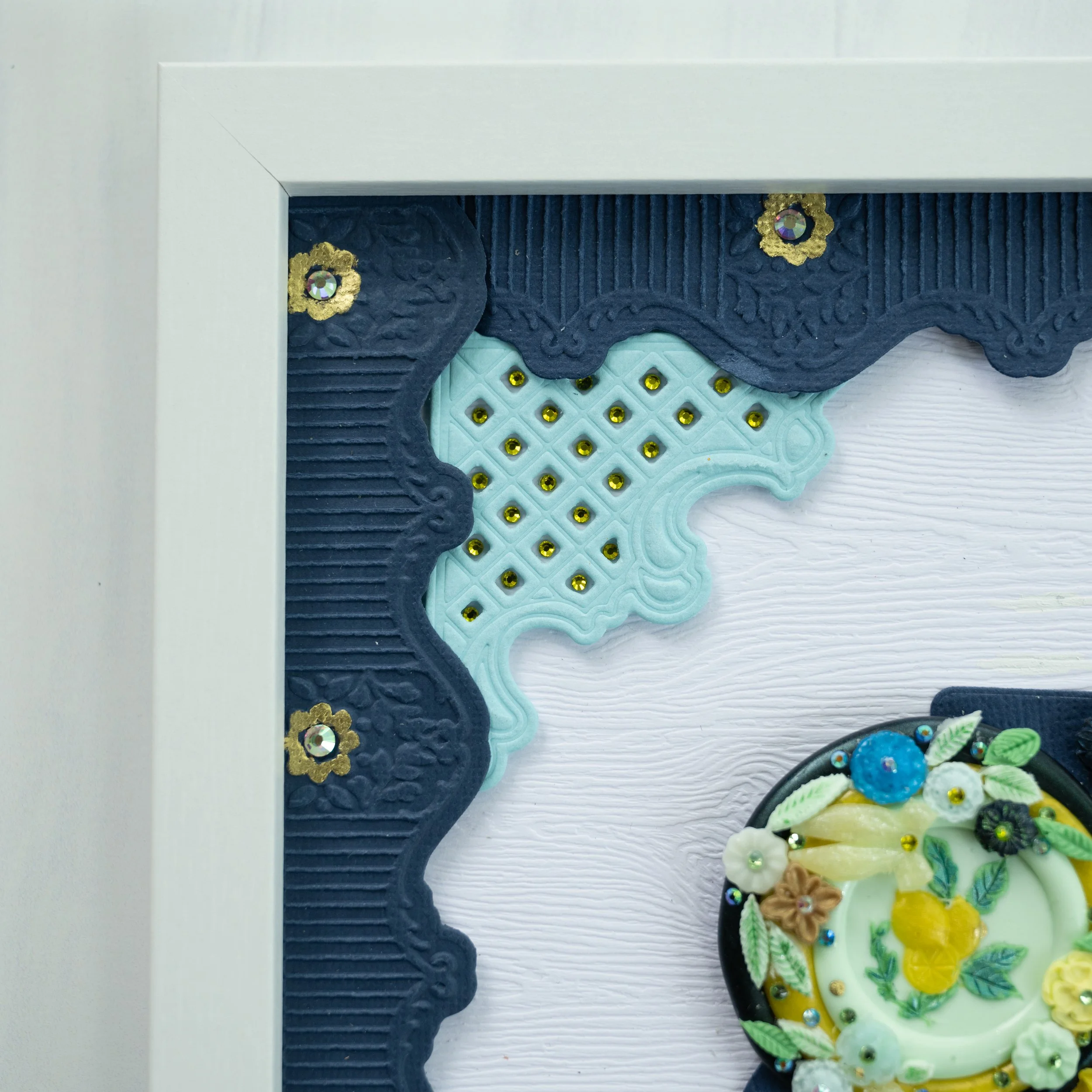
7) Then, I’m working on how to mount the seals. Sometimes, I like to make custom backgrounds but in this case, the colors were so bright, I wanted to keep it simple, so I chose a Gmund embossed wood pattern white cardstock as the base and decided on a navy mat layer of cardstock, unified by a beautiful grosgrain striped ribbon in navy and white. I created a border in the same navy cardstock from an Anna Griffin emboss and cut folder, and the corner pieces in light blue are cut from another Anna Griffin die (I’m searching her website but can’t find these two dies!). I then painted the flower embellishments within the embossed border with Kamenskaya gold ink and I used yellow rhinestones to ornament the corner pieces. Each of the seals as well as the border pieces are mounted with foam tape to give them a little “pop” off the page. In this case, too much pop because the center seal doesn’t want to fit under the glass of my frame because it’s too high!!
Thoughts on this piece - I went overboard with my embellishments. I wish that I had not used my extra wax mold flowers and leaves between the seals because in the end, to me the piece feels heavy and kind of like a big blob of wax. It’s definitely colorful but it’s just… a lot. I definitely tend to overembellish at times and I think this is one of those times. That said, I really enjoyed working with this palette. I still love lemons and they still evoke such a satisfying feeling in me in that the taste and color just pop! I really enjoyed using some new techniques here with paint, marbling, etc and in the end, creating something beautiful and learning something new are really always my goals and while this piece has a ornamental heaviness, I still enjoy looking at it and its sparkle and hope you do as well! This piece measures 12 × 12 plus the frame.