Entering the public domain
Above - trying to capture the shimmer in my new piece!
There are so many amazing resources out there for art in the public domain to draw from for inspiration and technique. My 2 most recent pieces were made using inspiration from artwork in the public domain which I “updated” to add/modify color and provide a frame for wax seal work. First, my work and a bit about it, and, second, some of my favorite public domain resources. If you aren’t familiar with what it means for a work to be in the public domain, here is a handy AI-generated definition because IANAL (although, actually I am, ha ha, but I no longer practice!):
Public domain works are “visual works not protected by copyright. Anyone can copy, modify, distribute, or use them for personal or commercial projects without permission or payment. They enter the public domain because copyrights have expired, were waived, or do not apply to that type of work.”
So, more on that below, but, first, my newest piece…
First, I splurged on the chinoiserie seal from Kathryn Hastings. Her wax seal course really got my mind expanding when I took it a year or so ago. I really respect the work she’s doing in elevating wax seals to an art form and her modern seals created from her original artwork are always stunning. She has impeccable taste and so I wanted to do her work justice by presenting it elegantly and in a way that referenced the history of her design.
I have long admired the work of Jean Baptiste Pillement, a French artist from the 18th century who was known for landscapes, but perhaps more commonly for his Chinoiserie sketches that were published as engravings. For a more in-depth look at Pillement’s work, I recommend Artvee.com (hint, this is one of my favorite resources discussed below). Chinoiserie art in the 18th and 19th centuries (and beyond, as evidenced in “Palm Springs” and “island” style, see the work of interior designer Amanda Lindroth, for instance ) is one of those moments of cultures colliding that fascinates me. I had been wanting to study Pillement’s brush work to practice creating my own loose yet full floral embellishments. I was really attracted to his “Floral Swags framing an Empty Oval” which is not one of his Chinoiserie pieces but more rococo in style - but seemed easier to analyze and work from to start with than his ethereal and fantastic Chinese-inspired landscapes.
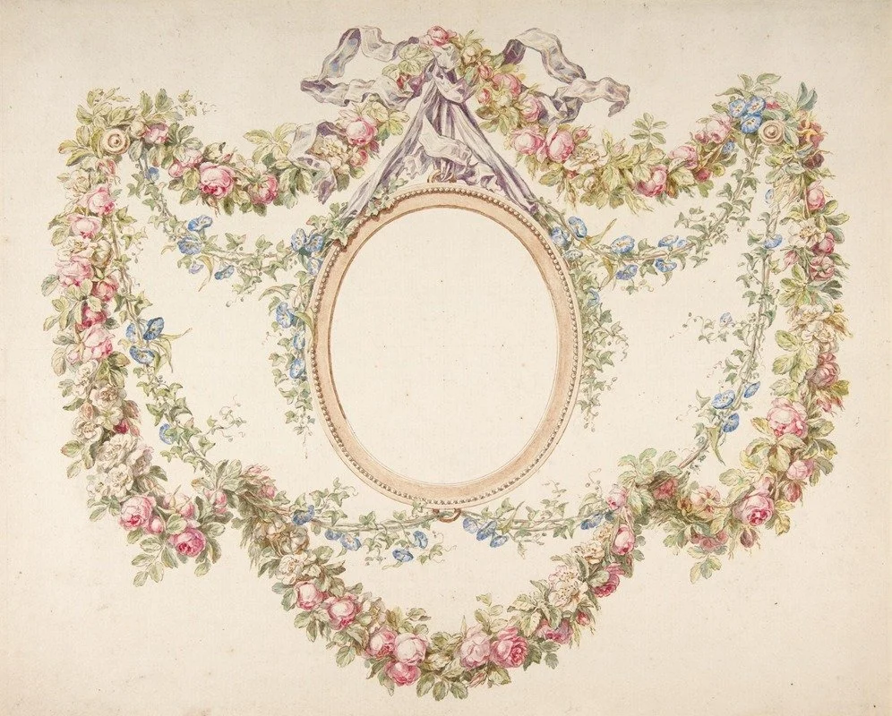
Available through artvee.com
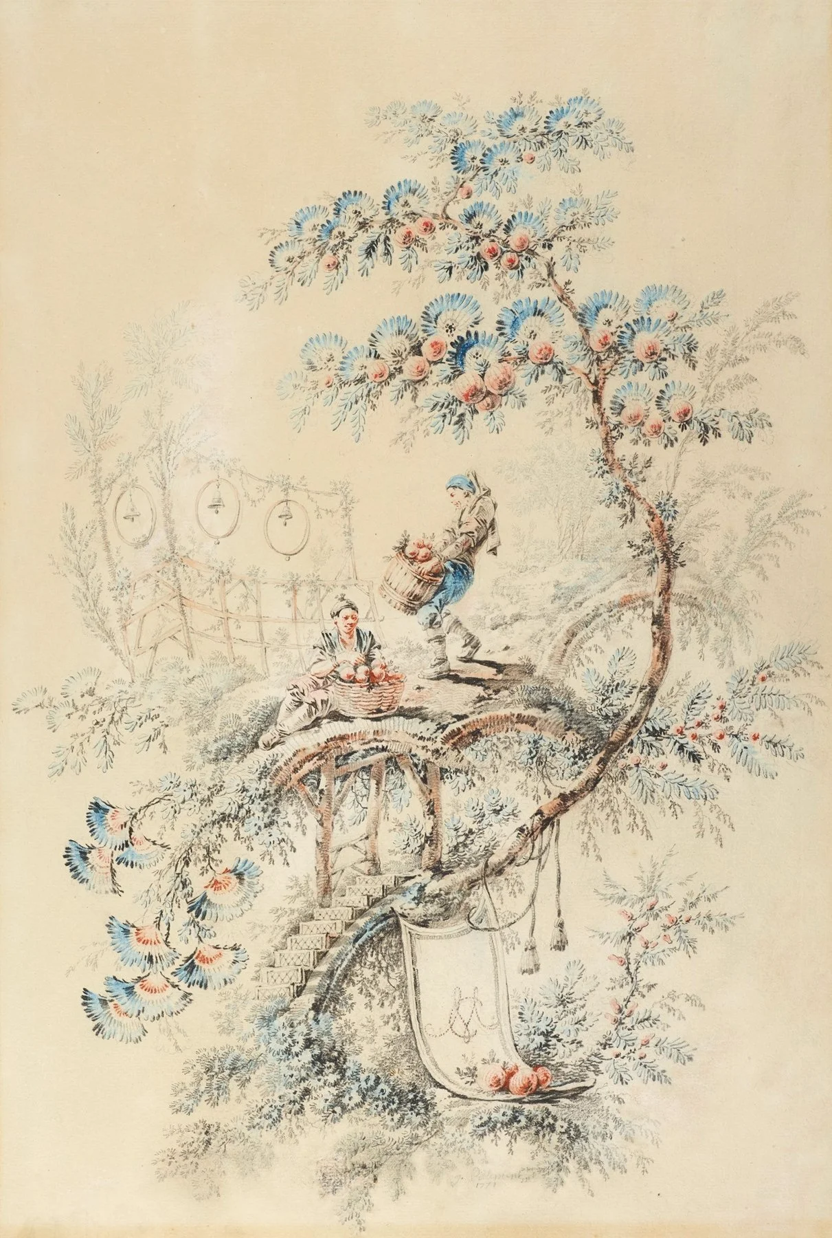
One of Pillement’s Chinoiserie works from artvee.com
The structures in his Chinoiserie works seemed reminscent of the structure in Kathryn Hasting’s Chinoiserie seal, with the stairsteps and the narrow pagoda-like building, plus the florals framing the building. Thus, Pillement’s Floral Swag seemed a fitting frame to the Hastings seal. I reworked the Floral Swag in Procreate using digital brushes from Lisa Glanz’s collections and printed on 12×12 Canon paper through my Canon image prograf. I then used Iuile metallic watercolors from the Magical Drop 1 collection to bring some shimmer to the print. Finally, I added size 6 flatback pearls and rhinestones in Crystal AB around the swags to add some additional sparkle.
For the seal, I used colors from Letter Seals and Air of Secrecy. The bottommost layer, I layered the wax around a tassel I got (from Temu! shh! which I do not endorse for cutting dies, embossing folders, etc, but is a great source for simple, CNC router wax seals and bits and bobs that are fun to add to work to give some more dimension or interest). I emphasized the oval cartouche and pagoda/stairs with Kamenskaya gold gilding ink which I have found to be my favorite gold/copper metallic paint to embellish seals. For silver, I love Molotow liquid chrome markers. For both of these, I release ink onto a piece of scrap plastic wrap and then apply using a small detail paintbrush.
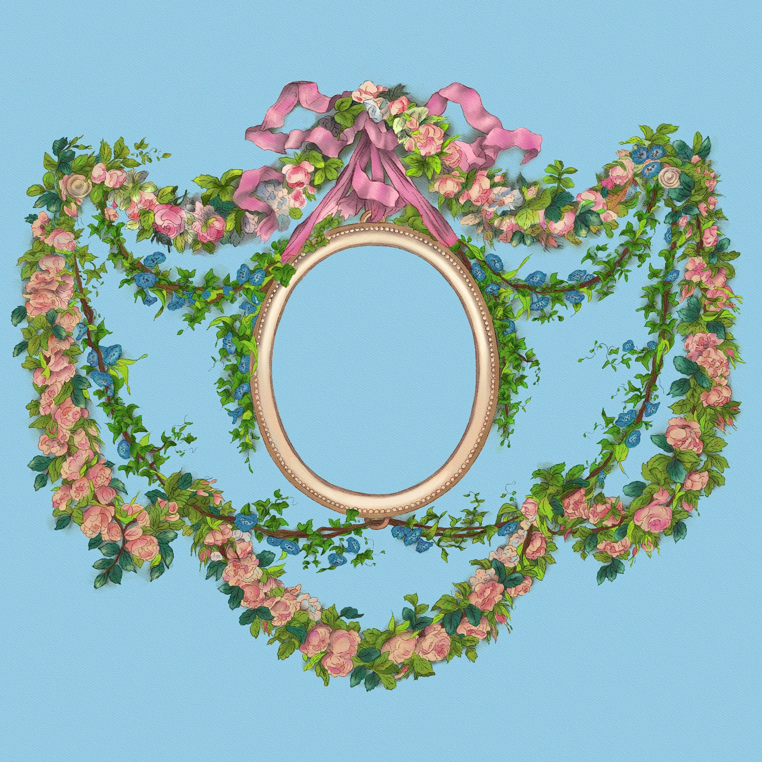
My procreate file, reworking the Pillement piece.
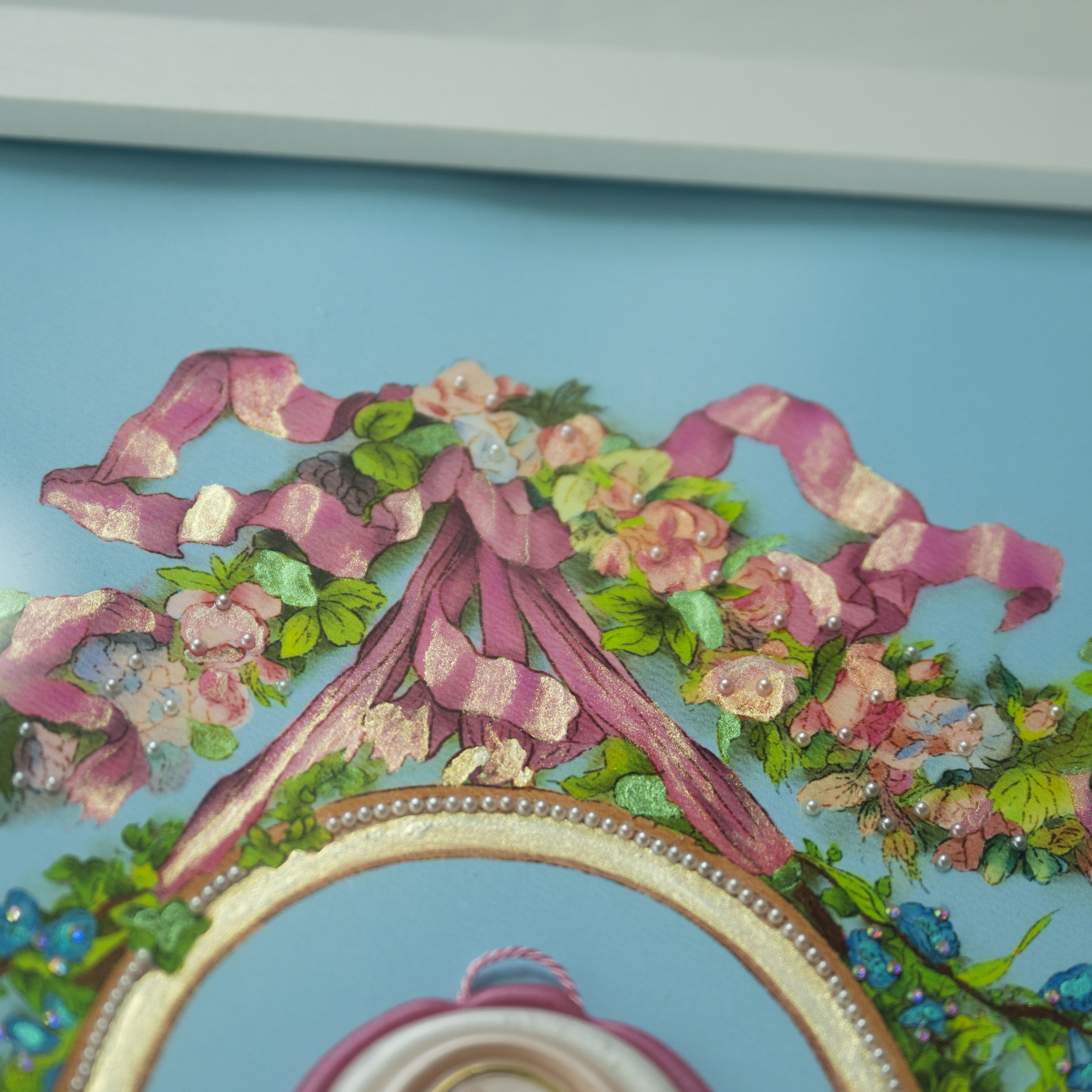
Detail showing the shimmer effect after Iuile watercolors were hand-applied, as well as small pearls and rhinestones.
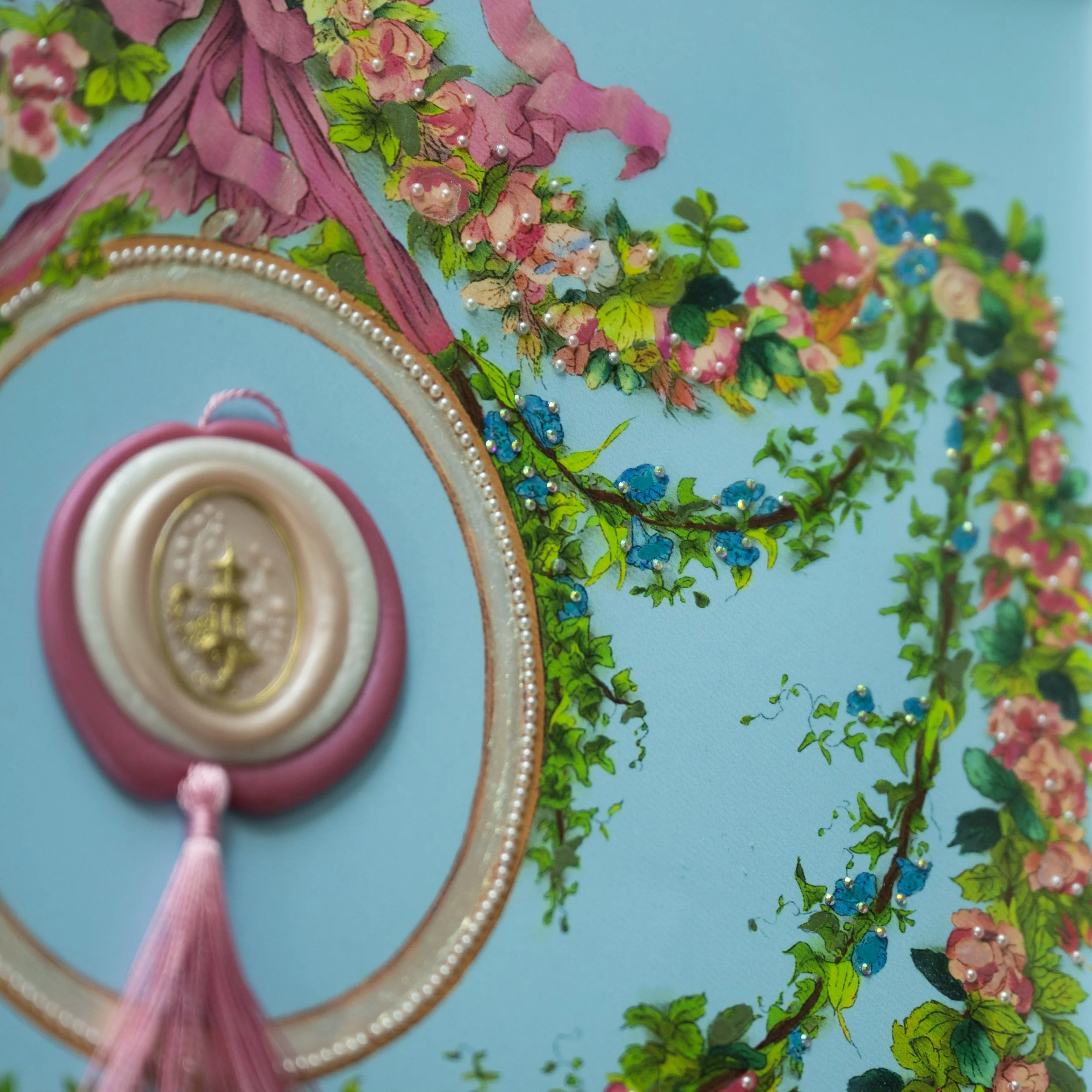
Another detail showing brushwork as well as hand-applied pearls and rhinestones.
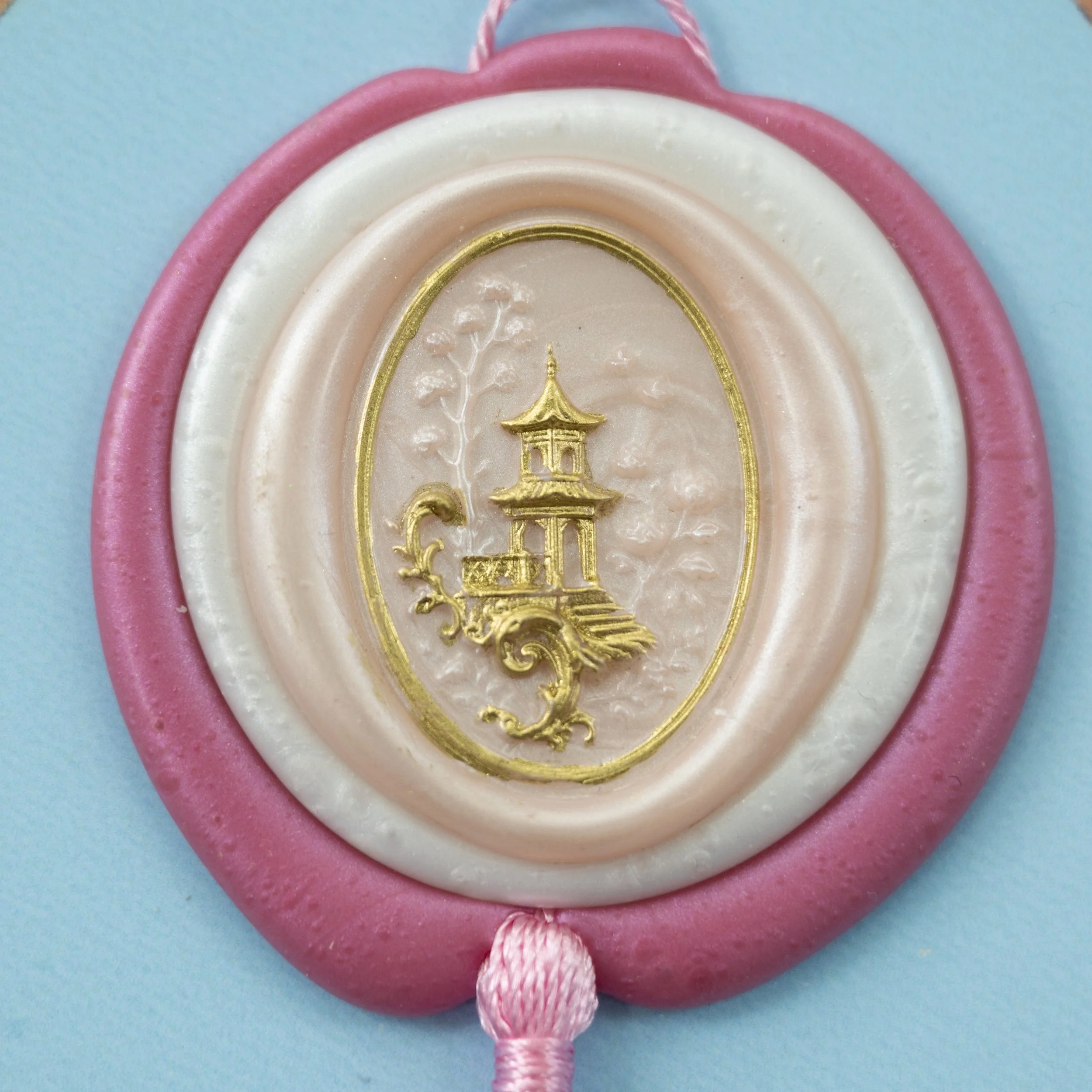
Detail image of the Kathryn Hastings seal with Kamenskaya gilding ink applied to emphasize structure.
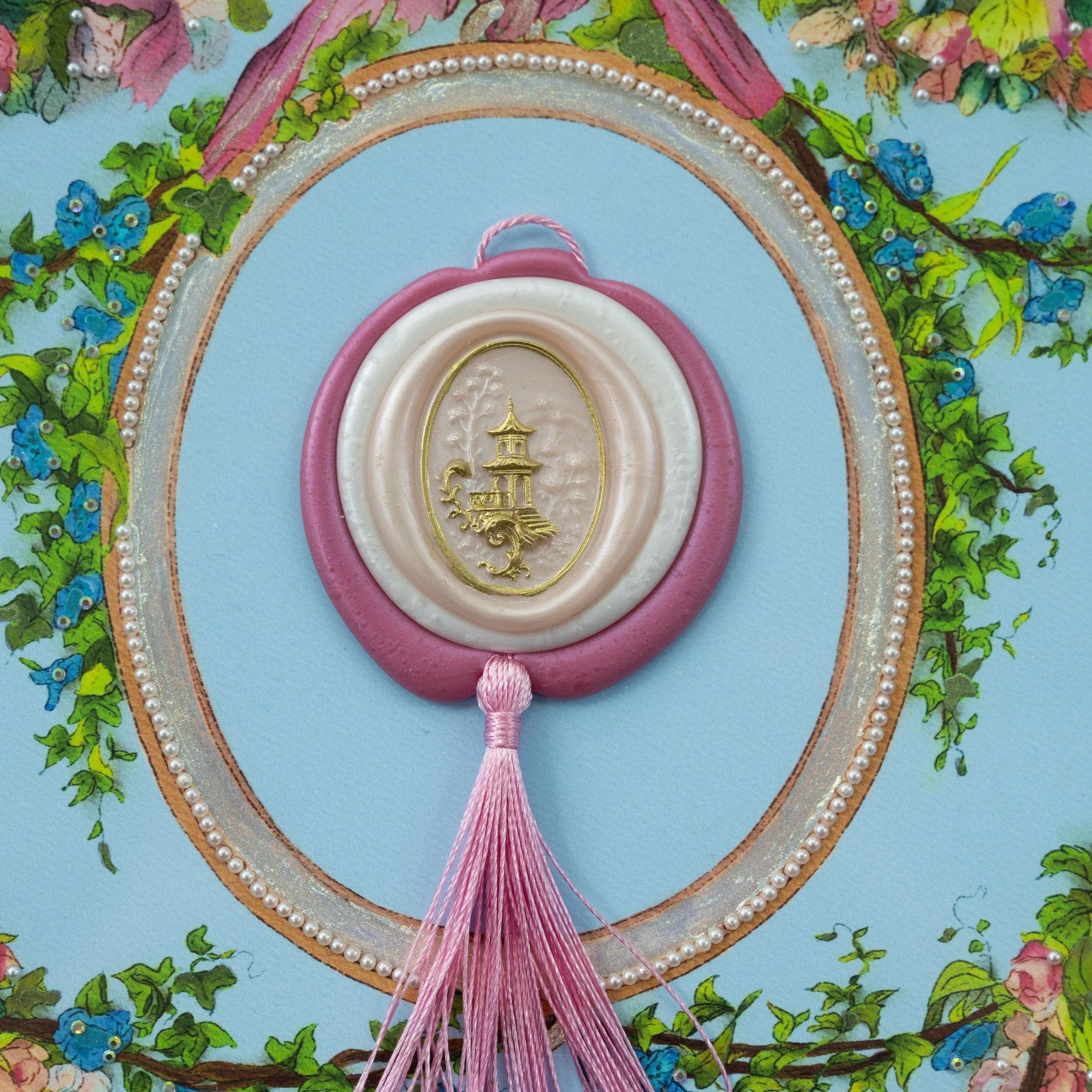
Detail image of the seal placed inside the oval. The oval frame is painted with gold metallic watercolor and each pearl was hand-glued to the paper.
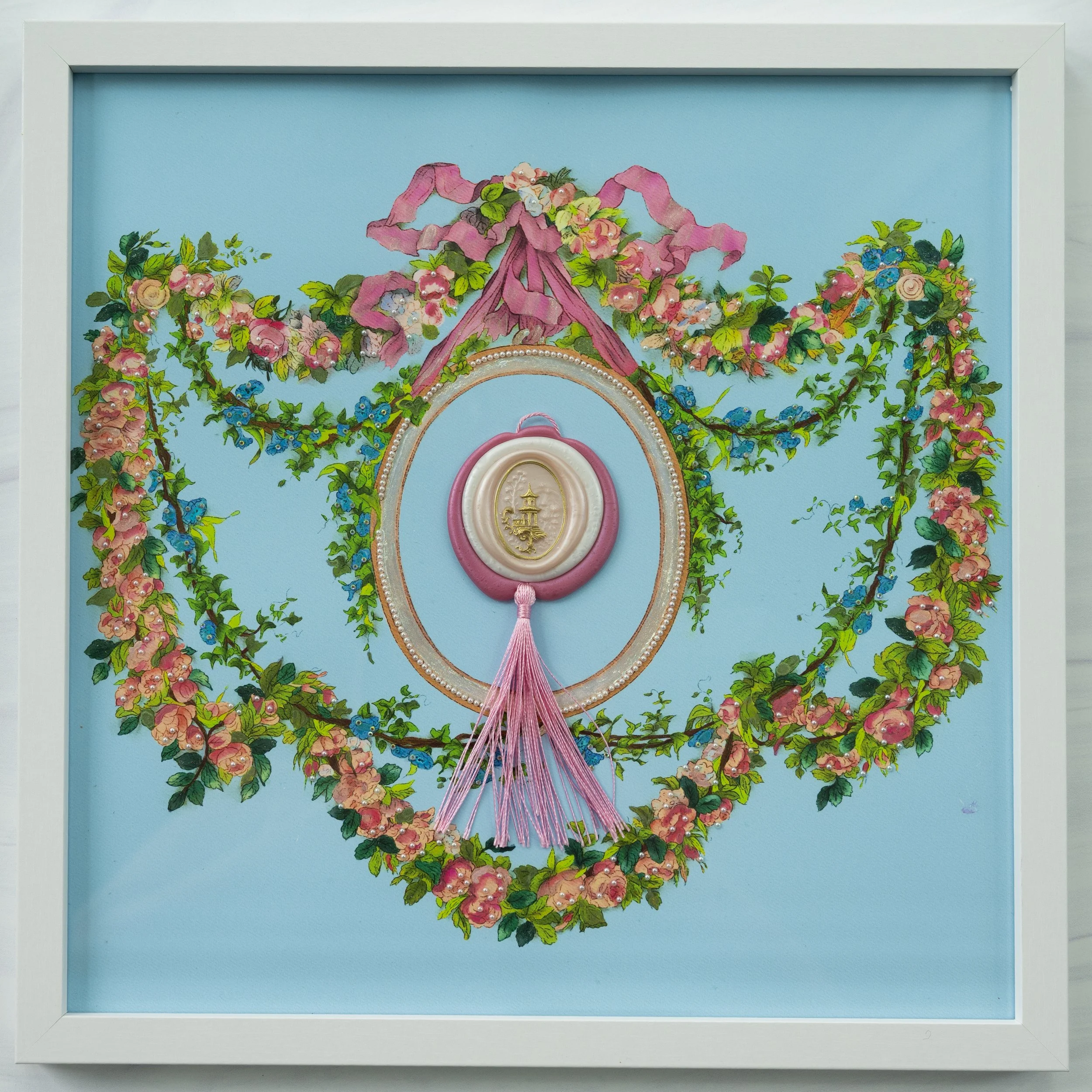
The finish piece framed. This is a 12×12 frame. I left the tassel spread because I liked the feel of movement it gave to the piece and felt it balanced the ribbonwrok above.
I chose this palette because I wanted to make the colors from the Pillement version more vivid. I also wanted to change the color of the ribbon to reflect the roses that were more pink in tone. The blue is a lighter version of the blue used to paint the swag flowers. Procreate background layer was really handy to be able to try out lots of different tones easily to see which one I liked. I felt like this palette was respectful to the original while bringing more intensity and a modern feel to the swag border.
Okay! Now for some public domain fun. Obviously, one source I really love is Artvee.com. The standard version of each work is available as a download for free. However, for just under $100 annually, you can get Artvee pro, which allows you to download a high resolution version of every image available. If you are interested in brushwork or fine detail, this can be very handy. Artvee looks for the best available version of artwork in the public domain, so if you have downloaded artwork in public domain before and been disappointed with the clarity or resolution, this site may address your concerns. I find the curation and collection as well as the background information very well-done. If you are looking for an alternative to doomscrolling, this is also a great resource as you may still be scrolling but at least you are learning things!
Another source I really like is clipart.com. If you go to the main website, scroll down to the bottom, there is a list of different resources available on clipart.com under the heading “Popular Searches.” Look for the Dover Publications link and click there. There are hundreds of collections from Dover Publications available, and you can go through them all. All of these are in the public domain, so they are great sources for inspiration! I’ve been collecting Dover Publication books for 35 years now and while they vary in quality, they are an amazing resource. For $99.95 a year for individual/non-commercial, or $199.95 for a professional license, you have access to hundreds of Dover resources. And, this way, you don’t have to deal with trying to photo or scan the hardcopy of the Dover book because you can just download the file from the website. Depending on the resource, there are jpg, png, and vector images. There is a drop down for each asset to tell you what’s available. I use these as a resource and I’m not reproducing works in many copies for sale - if this applies to you, be sure you check the clipart.com terms of use.
A third source that is more for ideas than specific artistic styles is the Public Domain Review. They publish scholarly articles on a range of topics with documentation available in the public domain and they have some really weird, thought-provoking stuff. If you are feeling in artistic rut for ideas, this is a good place to look because you never know what you’ll find there! They also have an “infinite scroll” of visual works in public domain linked to their articles, so, again, if you’re looking for alternatives to the ‘gram to scratch your dopamine itch, this is a nice option.
A final source I really enjoy is the Internet Archive, specifically for texts. Here are the search results for Pillement. There are thousands of historic texts scanned and available for use. Some of these texts are the original version that Dover adapted their books from and the resolution from the Internet Archive versions can be substantially better. Because there are over 8 million text resources available, finding inspiration is a bit of a needle in a haystack, but that can make it more fun too because you never know what you’re going to run into. I like to take a heading for a particular topic (such as ornamental art or decorative arts) and click into it and just see what has the highest number of views. One author/artist I’ve been spending a lot of time studying lately is the Victorian ornamental artist Christopher Dresser. More on him for my next post, but maybe try a search for his work on the Internet Archive and see what you find!
I hope this post was enjoyable and useful, and let me know if you have any questions!
-Christina